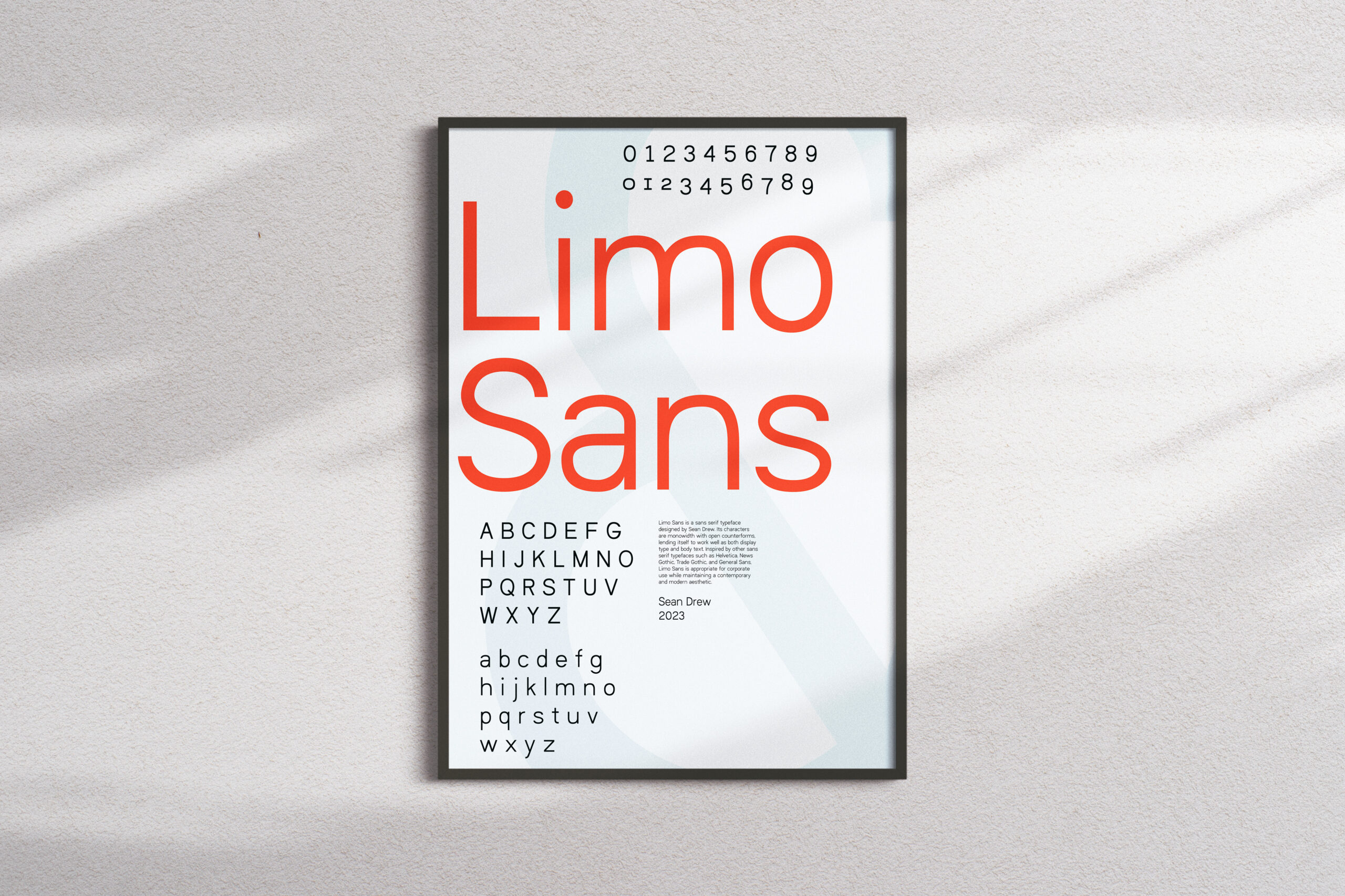
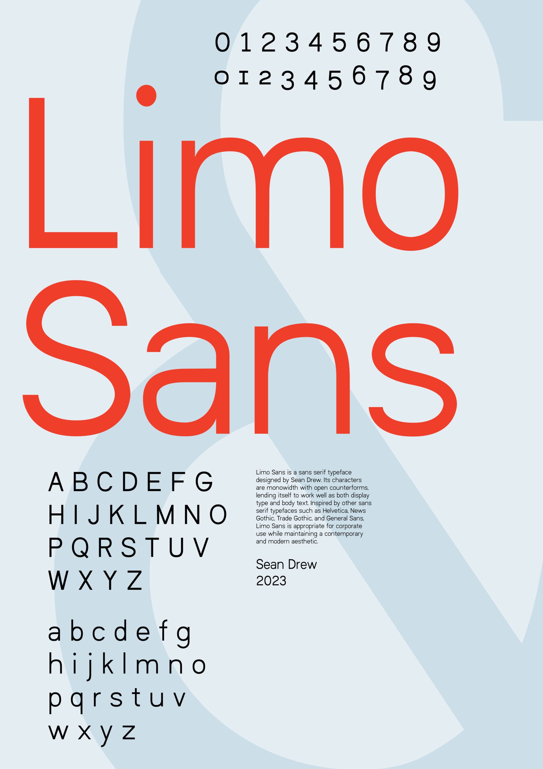
Limo Sans
Summary
Project Type: Typography design | Course: Typography 3 | Instructor: John Kane | Timeframe: Jan. – Apr. 2023
Overview
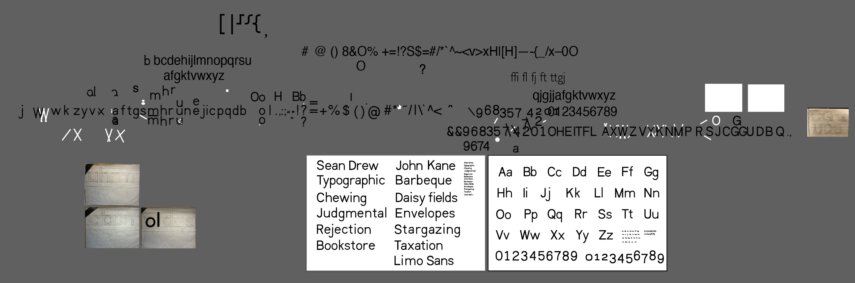
Limo Sans is a typeface I designed for my Typography 3 course instructed by John Kane. In just 3 months, I developed an entire set of upper and lowercase letters, lining and old-style numerals, a complete set of symbols, multiple ligatures, and adjusted several kerning pairs. Altogether, Limo Sans has 132 characters—all of which I drew.
Through creating my own typeface, I not only learned about proper metrics and proportions of letterforms; I have undoubtedly strengthened my eye for typography. I look at type differently now—I know what it does, how people read it, and what proper and improper use looks like. This skillset is invaluable as a graphic designer because I make certain that all of my work employs type in the strongest, clearest way possible.
Broadsides
Process
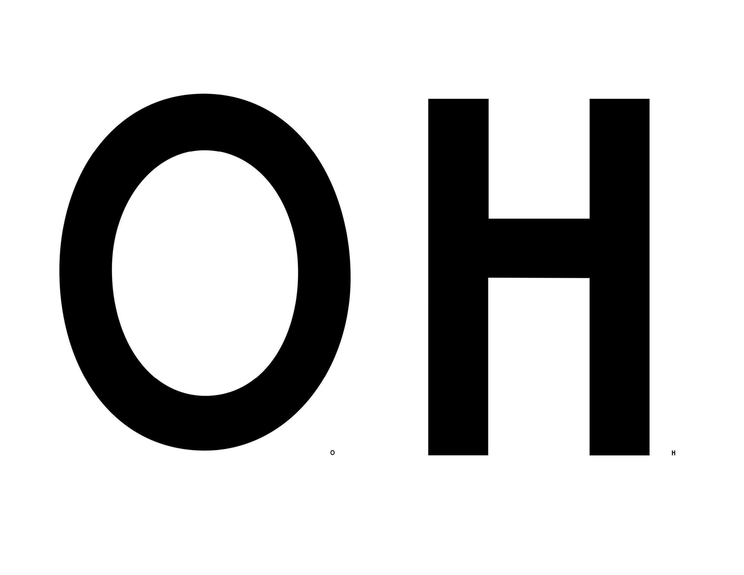
The first characters I created were capital letters "H" and "O", as all other charaters could be derived from their curves, angles, and stroke widths.
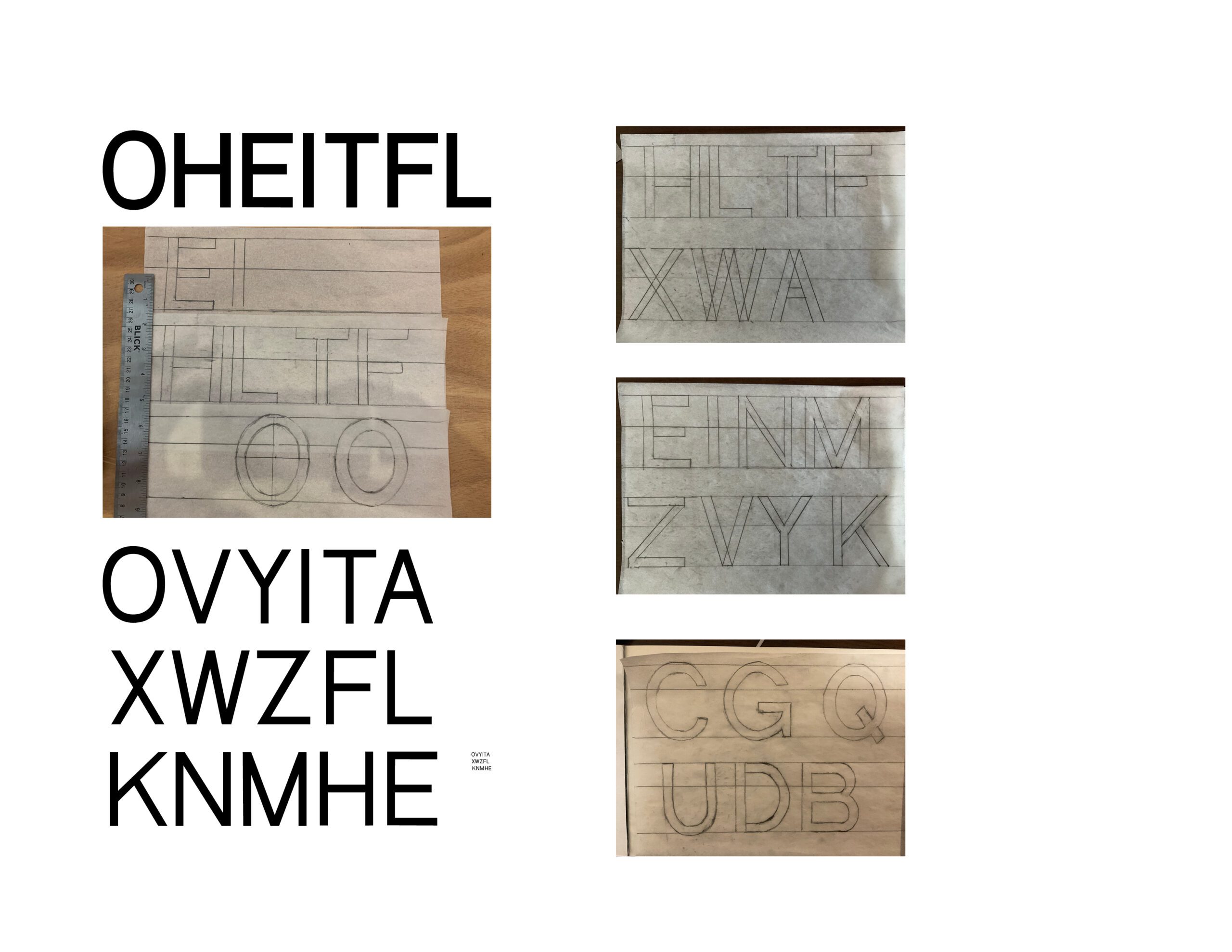
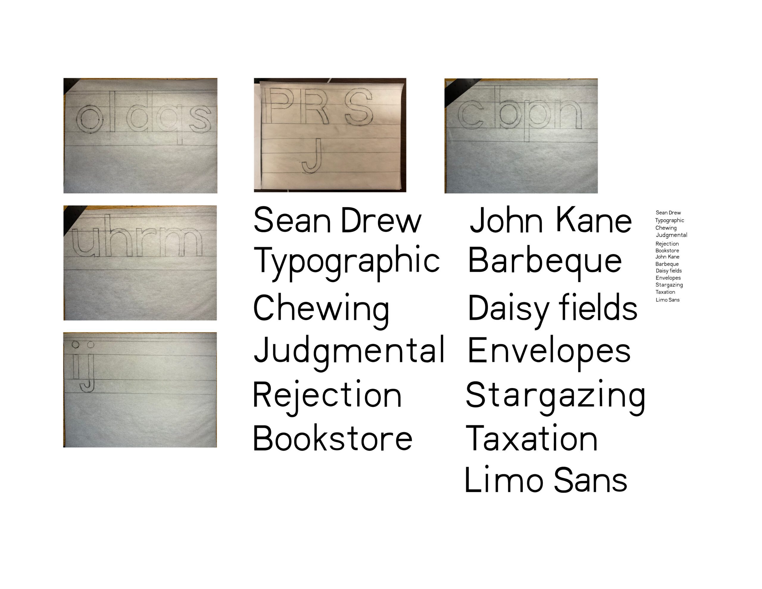
I used tracing paper to draw the other characters by hand and then I traced and refined them in Adobe Illustrator. I formed words and phrases to test how legible and reader-friendly the letterforms were. When characters looked off, I refined them.
Other Projects

Product PhotographyProject type

Environmental PhotographyProject type

Copley Square Farmers MarketBrand + Identity


Photo: Khoury College of Computer SciencesProject type

Historic City of ToledoBranding + Identity
Boston Beer CompanyCorporate Design

Truly Hard Seltzer Points of SaleCorporate Design